
Bridgefy MOBILe app
“Keeping People Connected No Matter What”
Team : Joshua Jaime and Brent McCormick
Duration : 3 Week Sprint
PROJECT OVERVIEW
Bridgefy is an award winning messaging app that has been used all across the globe for communicating in areas with unreliable internet connection by using a mesh network to send offline messages to other users nearby.
MY CONTRIBUTIONS
This is a project I worked on during my time with Bridgefy as a UX Designer part of a team of two in 2020. Within the team I assisted with Research, and Wireframing while leading the Visual Design, Interaction Design, and Prototyping portions of the project.
How Does Bridgefy Work?
Using mesh-networks to connect with friends
The Bridgefy messaging app utilizes mesh-network technology to enable users to create powerful chains of devices that allow them to connect with others over incredible distances, without necessitating access to an internet connection. Users smartphones behave as the “nodes” in the mesh-network, allowing information to bounce from phone to phone, potentially traveling for an unlimited distance.

understanding the problem

User’s Don’t Know What to Do
Currently the app requires specific instructions to use the chat functionality. Users are confused when using the app and attempting to message others around them because the interface does not guide them appropriately.

Interface Feels Outdated
Bridgefy doesn’t provide users with the messaging functionality they have come to expect from a modern messaging app. The lack of features that add value prevents users from using the app more consistently.
User’s aren’t returning because the app is too confusing
We thoroughly went through the app analytics and sent out surveys in order to find out where Bridgefy is struggling. What we learned was that the user base wasn’t consistently using the mobile app. Users expressed that the app didn’t do enough and it was too confusing to use its features.

Users Need an easy to use, modern messaging app
Our target audience are recreational socializers who consistently attend gatherings and events with friends or family. They require an easy to use, and modern messaging app that allows them to connect with others in an offline or online setting, no matter the location. Since the mobile app is directed towards a younger demographic, we focused on producing a minimal, clean look and feel for the interface.
exploring potential solutions
Iterations on Adobe XD
Designing a Better Experience
After dedicating the bulk of the design sprint (2 weeks) to researching the problem space and building empathy for users, we were able to fully commit to rapidly producing a viable, high fidelity solution that we could test and iterate based on user feedback. I quickly developed a Style Guide for the mobile app based upon guidelines Bridgefy had provided us in order to ensure that our solution remained consistent with the current brand.
There was some disagreement over the size of the Body Text…ultimately the text size was left alone as we decided to prioritize other usability aspects of the app.
How do we enable users to easily make the most out of the messaging interface?
Horizontal Scroll? Probably Not
Users needed an easy and simple way to access and initiate chats with friends on the app. With this in mind we iterated many different layouts to see what worked when it came to consolidating “available” users and “chats” under one tab. This specific design was the runner-up but later discarded as it became apparent that this layout would not perform well within the app.
The horizontal scroll “hides” available users, hurting the experience
Limited space for medium-long names
Through a quick round of testing, users stated that they assumed the horizontal scroll was for a “story” function
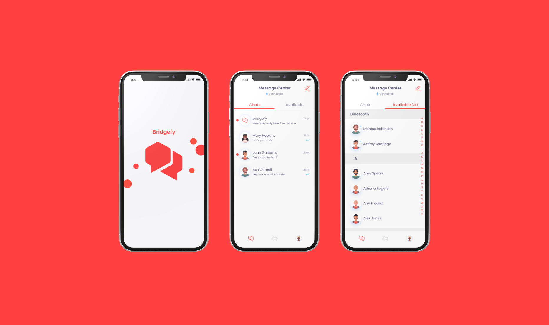
Final Design for the “Message Center”
Utilizing Tabs to Converge Related Content
By combining the “Chats” and “Available” sections under one tab, we were able to provide intuitive labels for users in order to make the screen easy to navigate within. Using this layout gives users the ability to access all aspects of messaging from a single location, ensuring that the flow is seamless and easy to follow.
Ensuring Alignment Throughout
Moved the “delivered” status indicators on the messages from the left side of the screen to the right side, aligning them with the edge of the timestamp in order to provide a more visually appropriate placement.

Users Read from Left to Right
Since users most often read from left to right, the “unread” icon was shifted to the left side in the final design. The number associated with the unread icon was also removed because the extra information brought more clutter than it did any substantial value to the user experience.
Proper Visual Hierarchy
Text was styled to appropriately present hierarchy within the interface. The most prominent text taking a heavier style while less important text being reduced in opacity and size in order to make the layout more readable. In addition the red accent color was used to guide users towards important/active elements within the interface so that tasks are made incredibly easy for even the newest user.
How do we streamline the flow for users composing a new message?

Using Recognizable Icons
The “plus” icon was replaced by the “compose message” icon to provide users with more context and information on what action the button is intended to accomplish.
Not by introducing unfamiliar flows but…
Early iterations for designing a new flow that made sending a new message easier, quickly turned out to be moving in the wrong direction. This initial concept reminded us to constantly keep in mind that our users spend most of their time on other applications, and expect a familiar process when using the Bridgefy messenger app. This concept made it…
Difficult to find friends
Limited space for content
Isn’t consistent with users expectations
Requires users to learn a new feature
Early Concept
Component with the green outline was the chosen iteration
…By keeping the flow familiar
Ultimately we opted for a much more direct and conventional method, leveraging user’s existing mental model so they can focus on their task at hand rather than learning a new flow. With that in mind, I experimented with the design of the checkbox in order to ensure all elements were easily noticed but not visually overpowering.
How do we provide a meaningful and useful bottom navigation bar?
By Removing Unnecessary Tabs
The contents of the bottom navigation was reduced from 4 tabs to only 3. Since Bridgefy insisted to make the tabs unlabeled, the next best thing was removing or replacing ambiguous icons and deciding which tabs were necessary. The “FAQ” section was dropped and the ”settings” icon was replaced with a graphic that better expressed the functionality of that tab.
Original Bottom Navigation
New Bottom Navigation
Profile tab
Personalizing the Experience
The icon for the “settings'“ tab on the bottom navigation was removed in order to more appropriately present the personalization present within the app. The users avatar is now the icon for the new “profile” tab, where users can access and edit personal information, settings, and learn more about the Software Development Kit (SDK) used to power the app.
The Solution
After many rounds of design iterations and experimentation over a 3-week period, we designed a functional prototype that enabled users to easily maneuver around the interface and make the most out of its features.
Bringing offline messaging to everyone
Intuitive Interface
We enhanced the messaging interface by leveraging common design layouts and user’s expectations, adding group messaging and consolidating the “available” and “chats” sections into one tab on the bottom navigation so users can access everything related to messaging from one place. This would improve the ability for new users to immediately recognize and adjust to using a new messaging app.
Emphasizing the SDK
Raising curiosity and awareness of the Software Development Kit (SDK) was one of the primary goals the Bridgefy team expressed to us. We implemented a carousel that holds the most pertinent information that Bridgefy wants users to access from this page, emphasizing the SDK as a “call to action” button that will increase traffic in that direction, ensuring that business goals are met within this design.
System Status Awareness
We made system status more visible and understandable for new and returning users. Ensuring that users are aware of limitations is arguably one of the most important things we did to prevent frustration with the app, and that the user experience is streamlined and effortless.
Message Center
To decrease the level of frustration and confusion users experience when using the Bridgefy app, we focused on making the interface extremely simple with easy to understand language, icons, and layouts.

Sending a new message is now never more than a tap away
Using Badges
System Status is implemented throughout the interface in order to keep users aware of what actions can be done. Using bluetooth badges to signify to the user when they are using bluetooth and who is available nearby via the mesh network. An alphabet scroll is used to expedite the process of finding friends who are available to message.
(Users are not limited to bluetooth messaging and are able to message and connect with others while using an internet connection as well).
Improving the users awareness of System Status
Connecting with Friends
To prevent any confusion users have when reaching out to friends, we focused on making a flow that leads users through the process of composing a new message.
Using Familiar Icons
We used an icon that users are familiar with from other messenger apps, in order to decrease ambiguity within the interface. By tapping on the “New Message” icon on the top right hand side of the screen, users can easily connect with other users in their contact list.
Composing a New Message
Affordances for an intuitive flow
Providing Affordances
To prevent any misunderstandings or confusion, we implemented “checkboxes” when users are selecting members for a group chat so it’s quickly understood what action they need to take.

improving the Scannability
Initially all chats had a white background, however this required more cognitive effort from the user to read through chats. The user’s chats are now presented in an easy to glance fashion, in order to provide quick recognition and reduce effort from the user.
Presenting the Bridgefy SDK
To increase the awareness and traffic towards the Bridgefy Software Development Kit (SDK), we emphasized the priority of it’s card within the “profile” screen.

The Bridgefy SDK is now emphasized to better align with the business goals
Using Cards to Evoke Curiosity
We designed a prominent call to action in order to pique the interest of developers looking to implement the capabilities of the SDK in their projects. We also designed a second card, intended to increase the rate of feedback from users, and with that, increase our understanding of Bridgefy users.
Sending a message to someone couldn’t be easier
We tested the prototype with the help of 6 participants, using a script to keep the assessment consistent between testers
What we learned
Users found the design intuitive and easy to use
Users were able to easily navigate through the interface
The SDK evoked curiosity and interest among users
6
Users Tested
100%
Users completed all tasks
6/6
Users found app easy to use
Key Screens
Bridgefy Messaging App
Messaging apps are often used during the evening hours, necessitating the need for a dark interface designed to reduce optical fatigue. Color saturation was reduced slightly for the dark mode in order to maintain legibility.
Bridgefy Messaging App (Dark Mode)
What’s next
The Bridgefy team was excellent to work with, and the seamless communication between us made this 3 week sprint as productive as possible. Our constant iterations brought forth a design that they were pleased with, and confident in, as they move forward with development on this new version of the mobile application.
In the future we would like to design an onboarding flow for new users, highlighting the value that this app would bring them, and setting expectations correctly so that users can enjoyably connect with others no matter what.