
Meals On wheels mobile app
“The All-in-One Delivery App for Seniors Serving Their Community”
Team : Joshua Jaime, Marissa Naraghi, and Ephrem Deribew
Duration : 2 Week Sprint
PROJECT OVERVIEW
This two week design sprint was a project based around re-evaluating and improving the Meals on Wheels volunteer experience. We followed the UX double diamond method to research and design solutions for our users.
MY CONTRIBUTIONS
In the course of this sprint I lead the development of wireframes, prototypes, and the final high fidelity deliverables.

Final Screens for the Route Optimization Flow
the research phase
WHO IS THIS FOR?
Meals on Wheels is a national organization, with local chapters being a mixture of public and privately run programs. They are one of the largest meal delivery services in the country with over 220 million meals being delivered each year.
Volunteers form the core of Meals on Wheels as an organization, and as a result the business generally needs to recruit and retain volunteers. Hiring volunteers that are consistent and dedicated is particularly important. With the rise of covid however, we saw that business costs have increased and the volunteer pool has temporarily decreased. With this in mind we wanted to design a mobile app that reduced or erased the frustrations experienced during the process while increasing the productivity of the volunteer.
understanding our users
In the discovery phase of the design sprint, we took the opportunity to learn as much about the organization and its volunteers as possible. We researched how the current workflow operates, and strived to understand what issues volunteers are facing while on their shift.
Multiple artifacts were developed to help drive our understanding of the user and business, expanding our knowledge of the volunteers experience. Our research included doing a business analysis, conducting user research, creating journey maps and user flows to paint a much clearer picture of our users and their problems with the current process.
Being able to view the process visually enabled us to discover problematic areas and pinpoint where volunteers are struggling the most.
MEET THE EMPATHETIC RETIREE
Through user interviews and affinity mapping, we came to learn that a large sum of volunteers are retired seniors who are dedicated to serving their community. The Empathetic Retiree is a persona based on that research, that I had constructed in order to give us a “user” that we can look back to as we continue with the design process. These users truly care for their clients and want to be efficient when providing them with the services that they need, so that they can complete their tasks in a timely manner without error.
User Persona

Volunteers spend most of their time making deliveries
Route planning apps were chosen as the perfect subjects for inspiration into how an efficient delivery system can be implemented. Since volunteers spend much of their time dropping off meals along their route, I decided to research into how this process could be made more efficient.

Key features from competitors
Route Overview
Progress Indicator
In-App Navigation
Route Optimization
Volunteers need efficiency
After thouroghly wading through the many insights and analyzing our research, we came to the realization of what key issue our users were experiencing. The process right now is unorganized and too reliant on volunteers being proactive and crafting their own methods to stay prepared and ready for their shift. Volunteers need a more efficient and usable system in order for them to more easily and productively do their job.
the design phase
Ideas & more ideas…
After assessing the problem, we began proposing solutions and discussing which features would be beneficial and take priority in the new app.
Ideating on Mural
Concepting
We designed iteratively, defining the structure of the app as a whole and implementing the features that were discussed as a team when we ideated. We explored numerous ways to present our solutions so that users had the best experience possible, keeping our persona in mind throughout.
Iterations on Figma
Colors, style, & ui design
As the fidelity of our wireframes increased, I took the opportunity to develop a style guide for the team to align with.
Choosing the right colors
The color scheme was pulled straight from the Meals on Wheels website in order to maintain a consistent tone for the mobile app. A grayish tint of the primary color was chosen for the text in order to avoid introducing new colors to the interface that would be unnecessary or inconsistent.


typography
Because we didn’t have access to the paid fonts Meals on Wheels currently uses on their products, we instead utilized similar alternatives in order to evoke the same feel.
components & ui styles
Buttons with rounded edges were chosen to be used within the app because their current website uses this style consistently.

The solution
After experimentation with various layouts and styles, we decided on a minimal appearance that would provide a spacious and easy to navigate interface for volunteers.

Rethinking the meal delivery process
mistake prevention
Volunteers were having difficulty keeping track of meal orders for particular routes. The checklist feature was implemented to reduce the number of mistakes and mishaps volunteers may experience when acquiring meals for clients on their route for that specific day.
route optimization
Many volunteers currently struggle with optimizing the route by hand. We implemented a feature that optimizes based upon the users starting and ending locations (by default, the starting location would be the volunteers ‘Current Location’). This would provide a more reliable and efficient system for volunteers to set up their delivery route.
accurate navigation
Frustrations arose over how much time is spent searching for a clients home through ambiguous directions and poor labeling of buildings. We solved this problem by providing in-app navigation and easy access to client info in order to more efficiently allow volunteers to complete their meal deliveries.
How does the app work?

double check your delivery
Upon arriving at the meal pickup location, users simply login to the app and utilize the checklist to avoid missing any meals.

Accurately arrive at location
Utilize the in-app navigation and client info cards to easily navigate to the destination for the delivery.

find the best route
The app automatically optimizes the best route for users as they enter the app, removing the need for any manual work.

conduct a quick evaluation
After making the delivery, simply fill out the evaluation form in order to quickly assess the clients condition.
Secure login
To maintain client privacy and adhere to HIPAA guidelines, the user is required to login to the mobile app before every shift, using a new passkey that will be sent out by management in order to prevent client info from being accessed when it shouldn’t be.
Quick and easy
In order to expedite the process of logging into the app, we designed a login page that remembers the users information and only requires a passkey.
Checklist
To prevent volunteers from experiencing the frustration of forgetting a meal, we designed a “checklist” screen that will aid volunteers in ensuring that all meals for a delivery are accounted for before they begin their route.
Providing affordances for easy understanding
Checkboxes and a counter representing the number of items in each specific section are provided to the user in order to increase the intuitiveness of the interface.
Route optimization
The client address list is updated before every shift and then optimized automatically to provide volunteers the most efficient route for their deliveries.
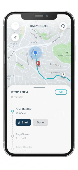

Empowering users
By default the route is optimized based upon the volunteers current location, however they can change the starting and ending locations anytime in order to provide more accurate optimization.
Progress overview
Volunteers are consistently kept aware of their progress as they navigate from destination to destination.


Map view
Volunteers can access a more thorough view of their delivery route, enabling them to get a more high level look at their destinations.
In-app navigation
To prevent any confusion that may occur when using third party apps for navigation, we implemented the ability to seamlessly receive directions to the clients location, all without leaving the app.


Voice Navigation
To improve the safety for volunteers while they drive to the client location, they are provided with voice navigation in order to reduce any distractions while they are at the wheel.
Client info
To reduce the frustration volunteers currently experience when looking for a clients home, we gave them the ability to access clients information in order to more quickly and more accurately reach their destination.


decrease location ambiguity
Volunteers can view an image of the clients home in order to provide more context and give a more accurate depiction of the clients location.
Client evaluation form
The final step for volunteers on any delivery is to conduct a quick evaluation of the clients health and condition so that the staff are properly notified when something may be wrong.


Using a checklist for quick input
The form utilizes a checklist because we understand volunteers are on the move and need a quick way to input client information regarding the evaluation of their condition.
Users found the design simple and easy to use
Through a quick phase of testing the prototype on three participants, we aspired to learn more about how people interacted with the product.
What we learned
Users understood what to do on the ‘Checklist’ screens
Users found the delivery flow easy to follow and intuitive
3
Users Tested
100%
completed tasks
3/3
Would use app to make a delivery
Key screens

Meals on Wheels: Volunteer App

Reflecting on the journey
With the end of this design sprint, there were several aspects that we did not have time to accomplish during the two weeks. In the future we would recruit test participants who actively volunteer with Meals On Wheels, gaining feedback and insights from them in order to continue improving the implementation of key features within the mobile app.
